×

SEARCH



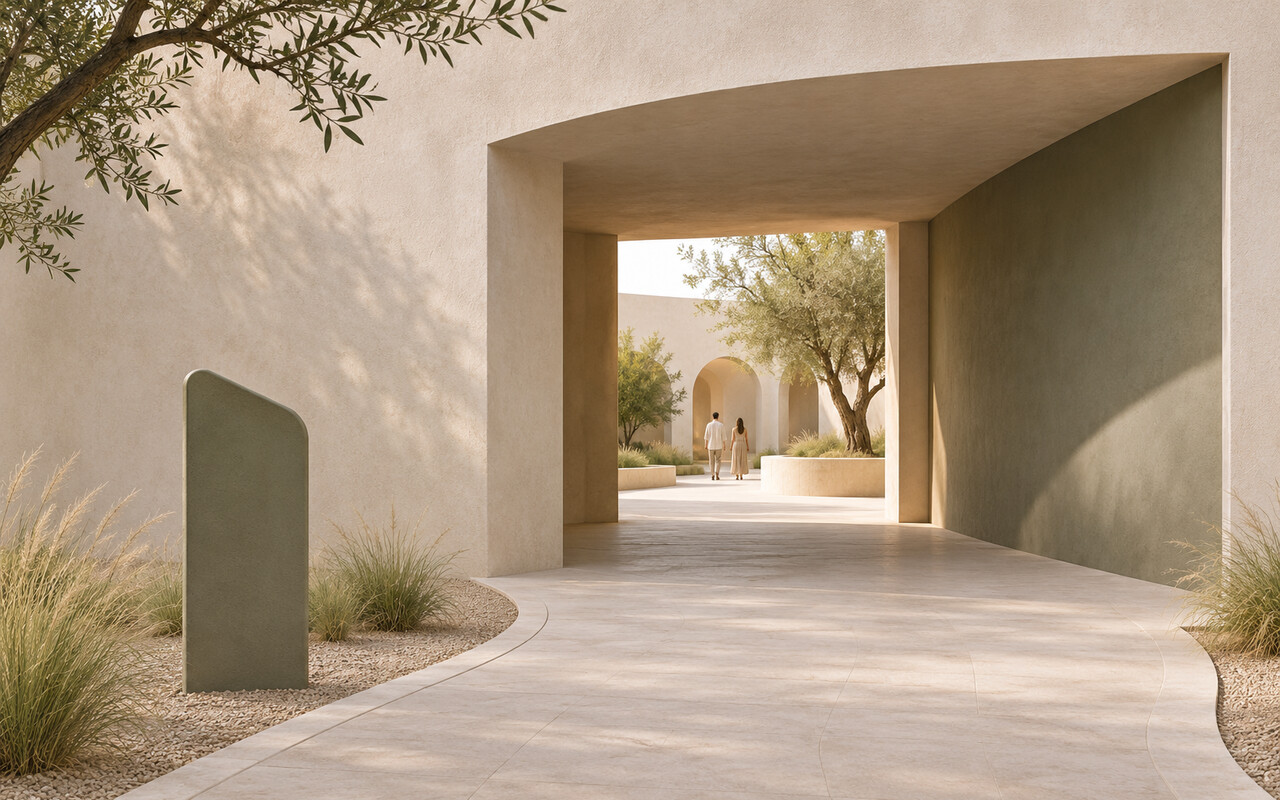
Visitors form an impression of a destination before they reach its front door. From the drop-off point, they look for the entrance, choose between routes and try to anticipate what comes next. If those decisions are difficult, even a striking entrance may struggle to make a good first impression. A legible arrival route gives people enough information to find their way and know they are still on track.
An arrow on a plan can make the entrance look obvious. On the ground, parked cars, trees or a bend in the path may hide it. Start the review from real arrival points: a transit stop, a drop-off area, a car park or a nearby pavement. At each point where a visitor has to choose, ask three questions: Can they see the destination? If not, what tells them where to go next? After turning, what confirms that they made the right choice?
A sign placed after a fork answers a question the visitor has already had to resolve. Moving one sign can sometimes do more than adding several. In other cases, signage is beside the point. Paving may draw people down the wrong path, lighting may make a service door look like the main entrance, or a queue may obstruct the pavement. Paths, lighting, signs and queue management should give visitors consistent cues.
Ask a few people unfamiliar with the site to find the entrance without help. Note where they pause, turn back or ask for directions. Check different ways of arriving, including with a wheelchair or a stroller: a route that seems clear to one visitor may lead another to a dead end. If several people hesitate at the same spot, fix that spot first. Then test the route again.
An entrance is where a visitor gets ready for the experience ahead. When the approach is clear, people can stop thinking about directions and start paying attention to the place they came to visit.
Related reading: SARAAJ’s design specialties.